Redesign of navigation and resume area of Vagas.com
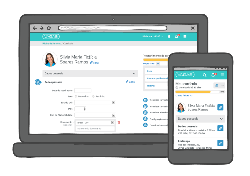
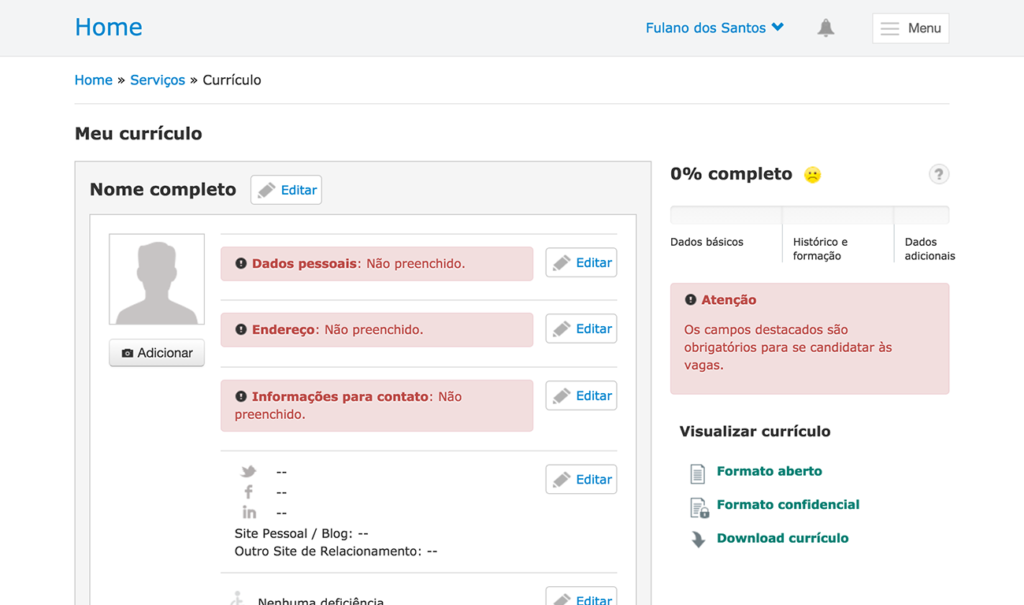
Vagas.com builds HR software and offers one of the most widely used job websites in Brazil. The redesign of the resume area and navigation of the candidates website was prioritized in 2013 due to prominent usability problems, such as:
- Poor user experience by demanding users to fill in the whole resume at once when signing up, a process that took around 40 minutes. Were to be an interruption in this process, the user would have to start all over again.
- Lack of mobile compatibility in a time when mobile access was steadily growing
- Lack of accessibility due to how the page was developed
- Confusing field labels
- Visually overwhelming
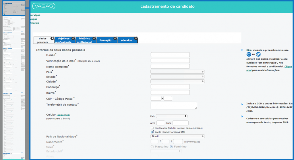
Not only did this impact users, it impacted the competitiveness of the HR service, as a larger number of candidates would be advantageous to clients.
The redesign
The main principles that guided the redesign were:
- Allowing users to complete their registration at their own pace
- Mobile friendly and responsive
- Accessible
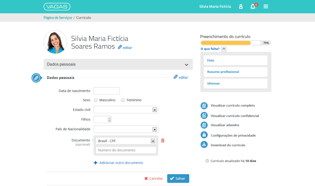
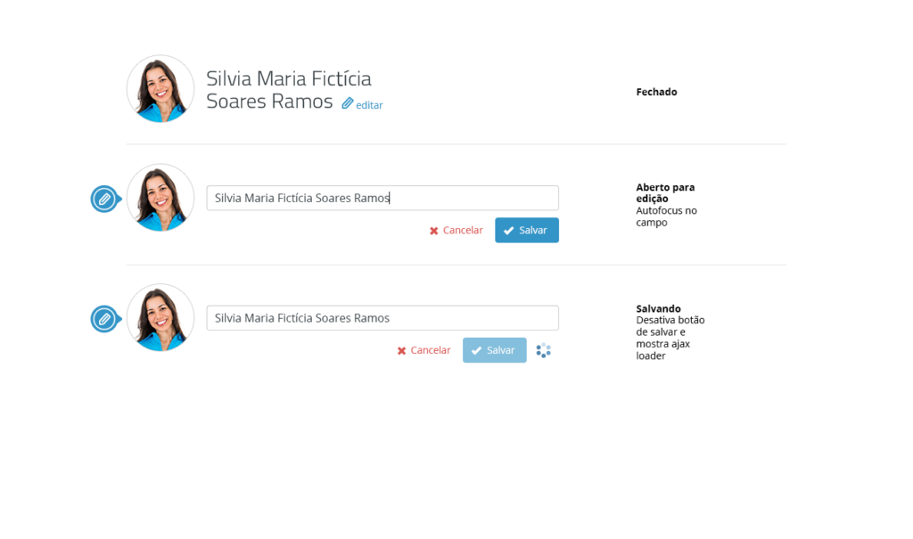
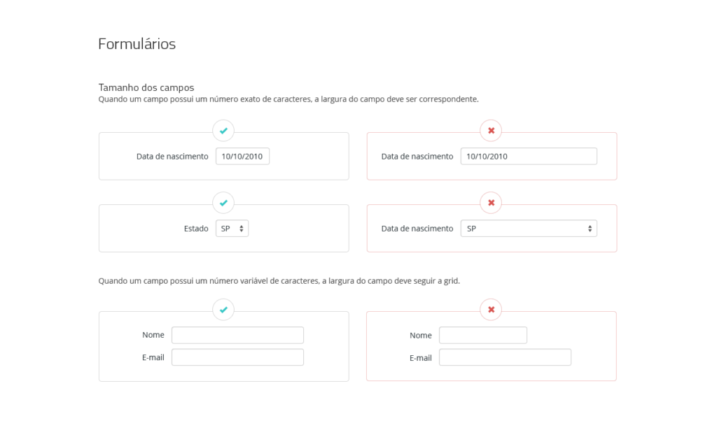
The resulting design was a responsive interface with inline forms, progress bar and clear feedback. The layout was constructed on top of a grid system and form design was informed by best practices, such as guidelines from Luke Wroblewski.
Testing and Launching
Before reaching the final redesign, a few mid-fidelity prototypes were tested with users and iterated over. Launching was gradual, starting with a small base of “beta testers”. Feedback was positive and mobile use grew further in the following period, highlighting the value of the redesign.

